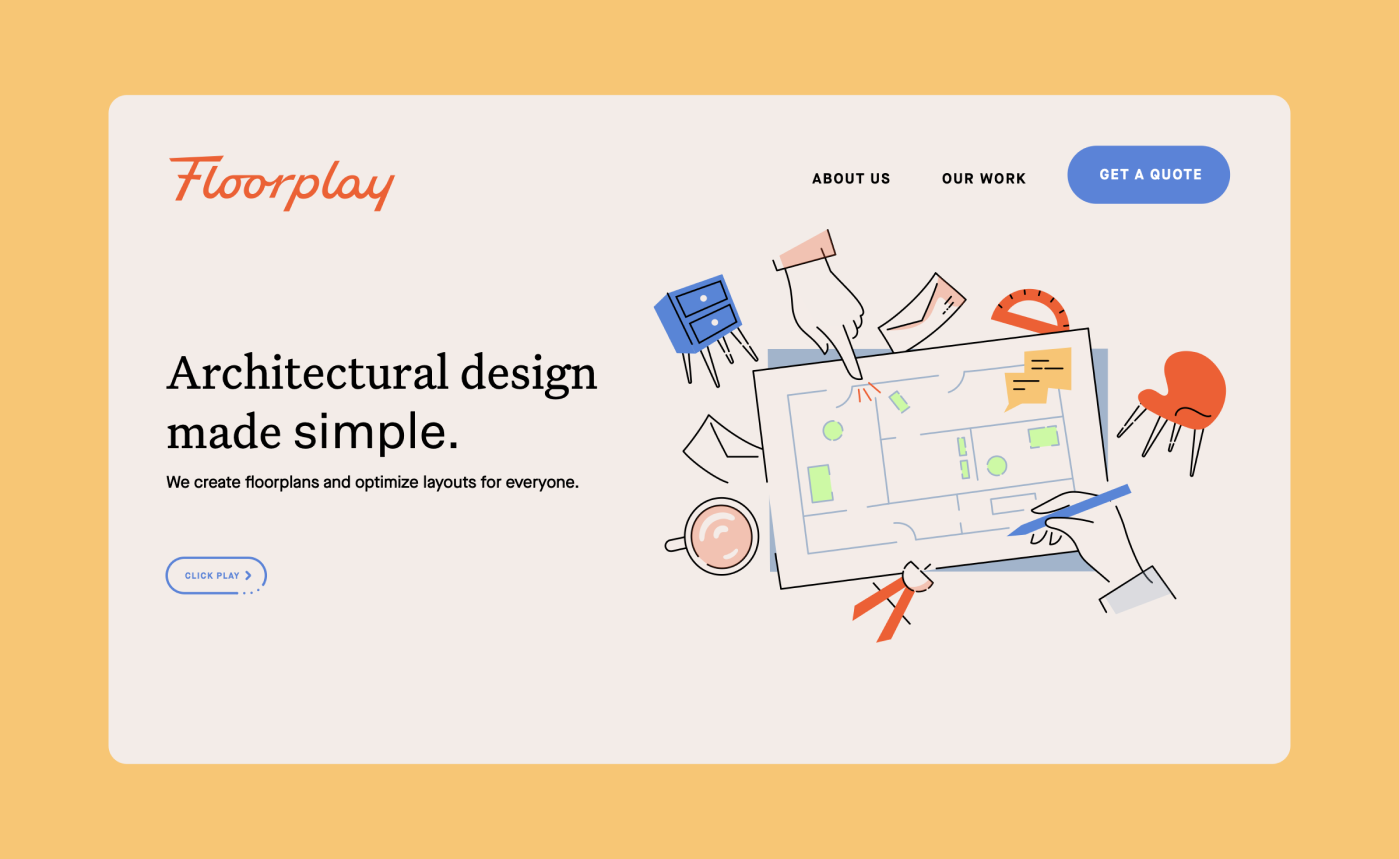
Architectural design made simple.
Hiring an architect can be daunting for an individual with a small project or small budget. Traditional architectural firms have high minimums and overall lack transparency in the process. Based in New York City, Floorplay operates on a completely different model. Taking on projects both big and small, you can e-mail them or slide into their DM's, and they were looking for a brand that clearly communicated that this is not your typical firm.
Our solution included a vibrant color palette, a playful and energetic custom logotype, and a social media strategy that would resonate with millennial homeowners.
BRAND IDENTITY
ILLUSTRATION
COLLATERAL
SOCIAL MEDIA
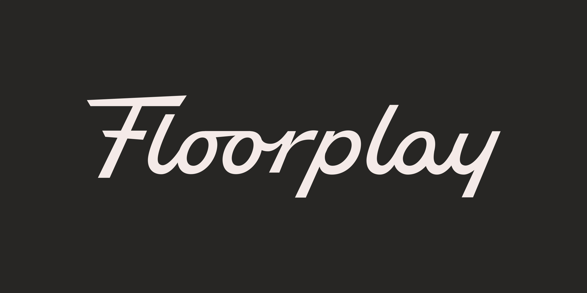
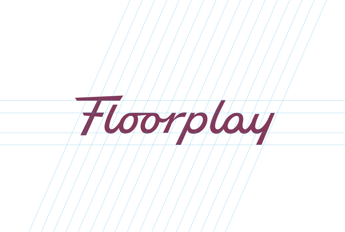
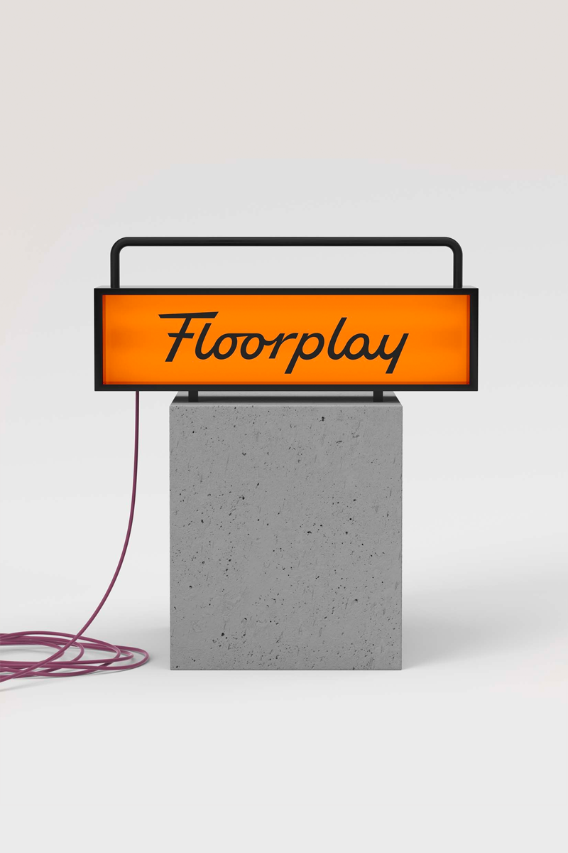
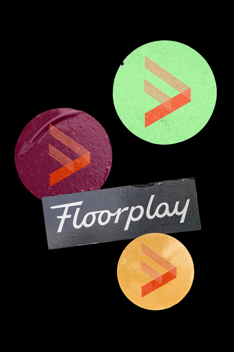
Logo
Floorplay's logo system consists of a custom script for its logotype and a mark that is a combination of an "F" and a "play" button.
Floorplay's logotype communicates youthfulness, energy, and captures some of the casualness and non-fussy nature of how Floorplay communicates with its clients.
The logomark's angles subtly hint at a 3D structure, and the lines were taken from the lines that make up walls on Floorplay's floorplans.

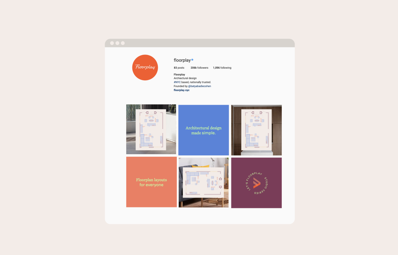
Social Media
All of Floorplay's clients found them through Instagram, so it was vital that the brand easily extended to social. Floorplay's primary content is floorplan layouts. Before the rebrand, the layouts were only in two colors which became redundant and it was difficult to see the difference between different options that Floorplay presented to the same client. Our solution was to color code the layouts which both made Floorplay's feed more beautiful, and it was easier to see at a glance the differences between options.